Forms
Guideline: Forms
Selected1
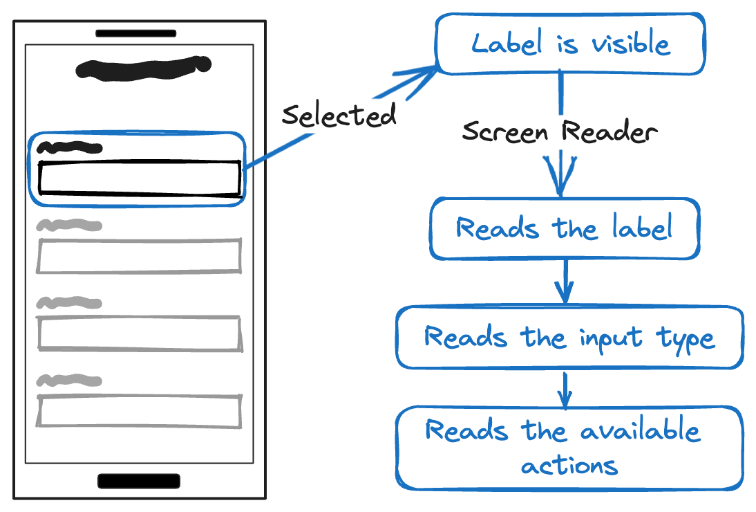
| State | I see | I hear |
|---|---|---|
| Normal | The Label | The label and the input type |
Focused
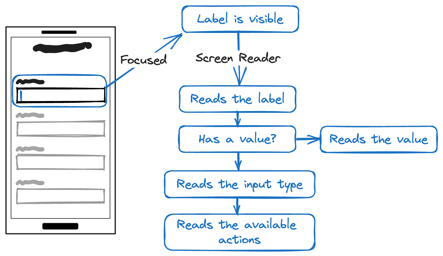
| State | I see | I hear |
|---|---|---|
| Focused | The Label | The label and the input type |
| Filled | The Label | The label, the value entered and the input type |
Disabled/Read only
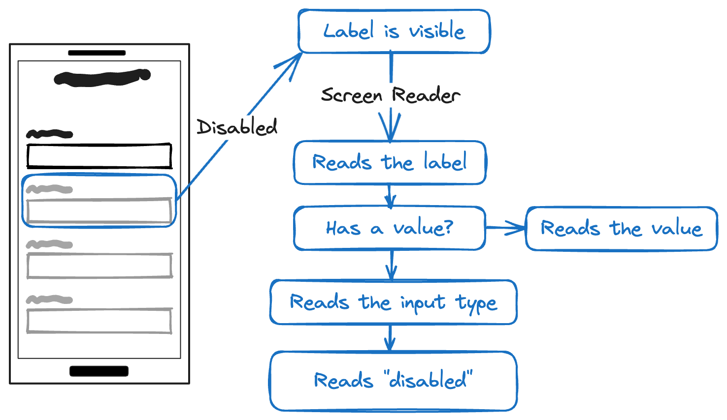
| State | I see | I hear |
|---|---|---|
| Disabled/Read only | The Label | The label, the value, input type and "disabled" |
Validation
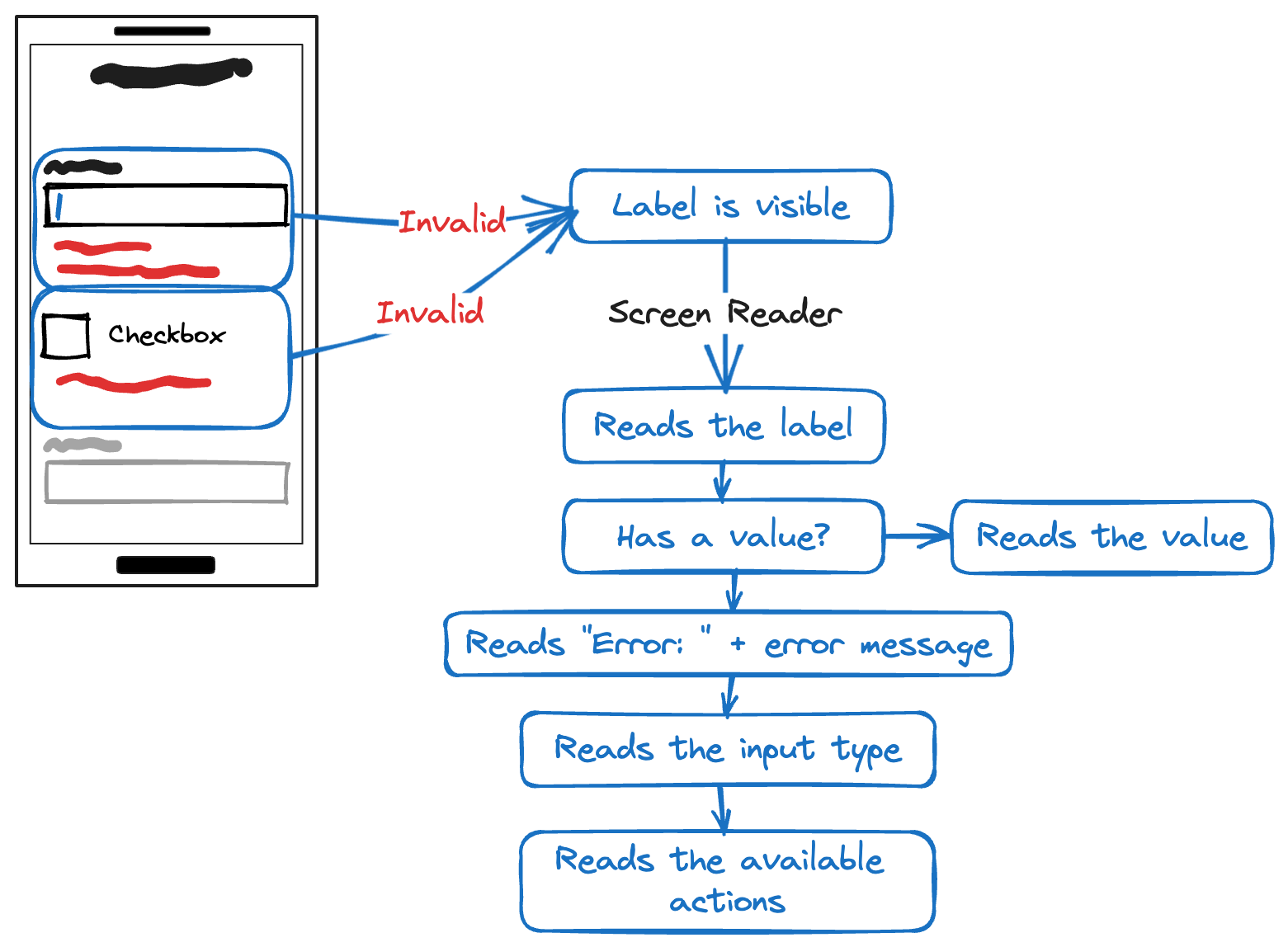
| Validation | I can |
|---|---|
| Succesfull | Move to the next field using the "Next" keyboard button. |
| Succesful | Submit the form using the "Done" keyboard button. |
| Invalid | Move to the next field using the "Next" keyboard button. I MUST not be trapped on the field |
| Invalid | Submit the form using the "Done" keyboard button. |
note
Currently, React Native API does not provide a method to mark an input text as being in an error state. https://github.com/facebook/react-native/issues/30848
Testing
Procedures
- Turn on a Screen Reader.
- Focus the form field.
- Evaluate whether the label adequately and uniquely describes the component.
Error messages
- Turn on a Screen Reader.
- Focus the form field.
- Trigger a validation error
- Confirm that:
- The error message is visible
- The error message is announced by the Screen Reader
Outcome
Ensure all the following checks are true:
- Ensure visual labels are available for all form fields.
- Confirm that a screen reader announces all form field labels accurately.
- Check that the label, even when isolated from context, distinctly and clearly conveys the control's purpose and the required user action.
- Ensure that field constraints are appropriately announced by a screen reader.
- Verify that required fields are distinctly indicated through a screen reader.
Error messages
- The occurrence of an error is signaled:
- The error is visibly displayed.
- The error is announced by a screen reader.
- Error messages offer clear insights and guidance on how to rectify it.
Footnotes
-
The "selected state" indicates that a Screen Reader user has focused on the field but has not initiated any action yet. ↩